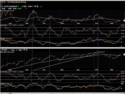
 Telechart T2112, the % of stocks trading 2 standard deviations above their 40-day PMA. This is what "Overbought" looks like, and I'm looking to short here or at the very least not go long, as a selloff is near. Keep in mind most of these moves are of 5% or more on the SP-500, even though it might not look like much on the chart.
 Telechart T2116, indicating the % of stocks 2 standard deviations BELOW their 40-day price moving average. When you hear the term "Oversold" from an analyst, this is what it looks like. Note the correlation between spikes in this indicator and sharp reversals in the SP-500 in the bottom half of the chart. You should be getting long here, or at the least not shorting, as a rally's approaching.
Look at the top part of the charts above. Look to the center pane of the top chart, immediately beneath where the Month is. There is a single wavy line that follows along with whatever I place in the top chart, with it's numerical value on the right side. This is called the "Ultimate Oscillator", and is a very good overbought/oversold indicator. When this gets above 80 or below 20 prices are getting pushed very far from their averages..notice how it's usually above 80 when the indicators peak. Immediately below that you'll see the third pane with two wavy lines that intersect often. This is the 35-day Time Segmented Volume and it's 21-day moving average. What I look for here is large spreads between the two lines...the further they are apart the more overbought or oversold the market is becoming. When you've got all three events occuring simultaneously you've got a very nice setup.
The market will be moving very quickly either up or down for these to spike, and you'll hear things like "The dow was up triple digits for the third day in row!" or "Dow posts biggest one-day loss in 6 months!" on TV during these times. The gang at the water-cooler will be saying things like "I've got to get into this market!" or "I just sold everything..who knows where this will end." But you will have your handy-dandy "extreme indicators" telling you differently. Hopefully this will help you time your trade, or at the very least not do the exact opposite of what you should be doing and getting clobbered by a reversal. That hurts...believe me I know.


No comments:
Post a Comment